IN THIS ARTICLE
O3DE UI 组合框组件
使用组合框从下拉菜单中为用户提供选项列表。您可以定义输入框是否可编辑。可编辑的输入框允许用户键入值 * 或* 从下拉菜单中选择一个值。
使用指南
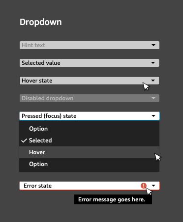
在使用组合框设计 UI 时,请遵循以下准则:
当用户将鼠标悬停在组合框上时,组合框周围应显示一条边界线。
使用下拉列表为用户提供一个选项,以便从一组互斥的选项中做出单个选择。
当选项数量大于 2 且小于 “a lot” 时,请使用下拉列表。当您只有一个或两个选项时,请改用 单选按钮 组。很难为选项的数量设定上限,因为它取决于上下文。但是,如果用户可能熟悉这些选项,并且选项井然有序且易于扫描,那么拥有一长串选项是可以接受的。
设置大多数用户可能会选择的默认值。如果您选择不使用默认值,请改为包含强而清晰的占位符文本,例如“select size”。
对值进行排序以最好地匹配用户的心智模型。请根据用户对选项的预期排序方式(例如连续日期或汽车型号)做出最佳判断。通常,使用字母或数字顺序是合适的,或者您可以考虑按主题对选项进行分组。
使用组合框时,请避免以下设计选择:
- 当用户可能想要选择多个选项时,不要使用下拉列表。在这种情况下,请改用一组复选框或按钮。
基本组合框
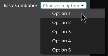
在 Qt Designer 或代码中设置和控制组合框。
示例
#include <QComboBox>

// Create the combobox.
QComboBox* comboBox = new QComboBox(parent);

// Add choices to the dropdown menu and set the default value.
for (int i = 1; i <= 5; i++)
{
    comboBox->addItem(QString("Option %1").arg(i), i - 1);
}
comboBox->setCurrentIndex(0);

// (Optional) Use placeholder text if you choose not to set a default value.
// When setting placeholder text, the combobox must be editable.
comboBox->setEditable(true);
comboBox->lineEdit()->setPlaceholderText("Choose an option");
comboBox->setCurrentIndex(-1);

// To disable the combo box:
comboBox->setDisabled(true);
带有验证器的组合框

在以下示例中,定义了一个简单的验证器。验证失败时,组合框的输入框中会显示一个错误图标。
默认的 QComboBox 实现仅将验证器设置为底层的 QLineEdit,用于可编辑的 QComboBox 小部件。AzQtComponents::ComboBox::setValidator函数将验证器绑定到 QComboBox,并且在 QComboBox 本身被销毁之前不会删除它。
示例
#include <AzQtComponents/Components/Widgets/ComboBox.h>
#include <QComboBox>

// Define a simple validator where the first choice is always invalid.
class FirstIsErrorComboBoxValidator
    : public AzQtComponents::ComboBoxValidator
{
public:
    QValidator::State validateIndex(int index) const override
    {
        return (index == 0) ? QValidator::Invalid : QValidator::Acceptable;
    }
};

// Add the validator to a previously defined combobox.
auto validator = new FirstIsErrorComboBoxValidator();
AzQtComponents::ComboBox::setValidator(comboBox, validator);
C++ API参考
有关 组合框 API 的详细信息,请参阅 O3DE UI 扩展 C++ API 参考 中的以下主题:
相关的 Qt 文档包括以下主题: