IN THIS ARTICLE
O3DE UI 滑块
使用滑块使用户能够通过水平或垂直移动旋钮或杠杆来控制变量。视觉反馈向用户显示当前值在有效值范围内的位置。
Slider
基本滑块是 Qt 库中 QSlider 小部件的样式版本。
对有符号整数值使用SliderInt类,对双精度值使用 SliderDouble 类。
Slider combo
滑块组合是滑块和旋转框 Widget 的组合。在实践中,用户可能很难精确地操作滑块。因此,建议对于精细控制,使用滑块组合,它将滑块的视觉反馈与旋转框的精确微调功能相结合。

对有符号整数值使用SliderCombo类,对双精度值使用 SliderDoubleCombo 类。
使用指南
在使用滑块设计 UI 时,请遵循以下准则:
当特定值对用户无关紧要,并且近似值足够好时,滑块效果最佳。示例:选择卷或定义颜色渐变。
在 UI 上放置滑块控件时,最好将结果与控件并排显示,以便用户可以查看并确认他们选择的值是否符合他们的预期。
使用滑块时,请避免以下设计选择:
- 当选择确切值对界面目标很重要时,不要使用滑块。
- 如果您没有用例的 start 和 end 值,请不要使用滑块。请改用 number edit 输入框。
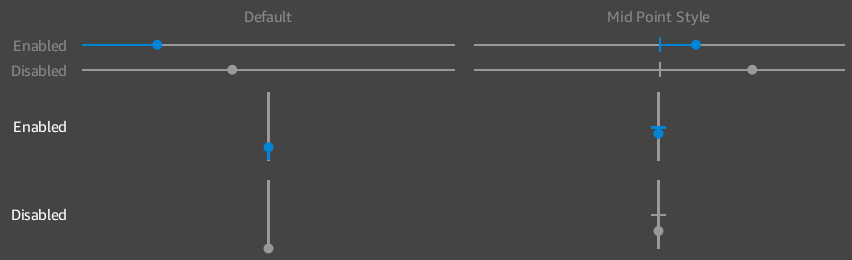
带中点的基本滑块

下面的示例演示如何使用可选的中点样式创建简单的整数滑块。
示例
#include <AzQtComponents/Components/Widgets/Slider.h>

// Create a new integer slider widget.
AzQtComponents::SliderInt* sliderInt = new AzQtComponents::SliderInt(parent);

// Set its range from -10 to 10 and its initial value to 2.
sliderInt->setRange(-10, 10);
sliderInt->setValue(2);

// Apply the optional midpoint style to visually represent the midpoint along the slider.
AzQtComponents::Slider::applyMidPointStyle(sliderInt);

// Use setEnabled to disable a slider.
sliderInt->setEnabled(false);
带工具提示的滑块

添加工具提示,以便为滑块中的值提供上下文。
示例
#include <AzQtComponents/Components/Widgets/Slider.h>

sliderInt->setToolTipFormatting("Opacity", "%");
基本滑块组合

以下示例演示了如何创建双滑块组合。
示例
#include <AzQtComponents/Components/Widgets/SliderCombo.h>

// Create a new integer slider widget.
SliderDoubleCombo* sliderDoubleCombo = new SliderDoubleCombo(parent);

// Set the range of the slider from 0.0 to 100.0.
sliderDoubleCombo->setSoftRange(0.0, 100.0);

// Set the initial value shown in the input box and the slider to 75.0.
sliderDoubleCombo->setValue(75.0);

// (Optional) Set the range of valid values for the input box.
// While the slider can adjust the value between the min and max of the soft range,
// the min and max of the range determine what can be entered in the input box.
sliderDoubleCombo->setRange(-1.0, 100.0);
C++ API 参考
有关 滑块 API 的详细信息,请参阅 O3DE UI 扩展 C++ API 参考 中的以下主题:
Slider:
Slider combo:
相关的 Qt 文档包括以下主题: