IN THIS ARTICLE
O3DE UI Tab 组件
使用选项卡使用户能够在高级别组织内容,例如在视图、数据集或应用程序的功能方面之间切换。
选项卡也用于 Widget 标题中。当有多个小组件停靠在一起时,小组件标题将显示为选项卡。用户可以拖动选项卡/小组件标题以移动它并将其停靠在其他位置。
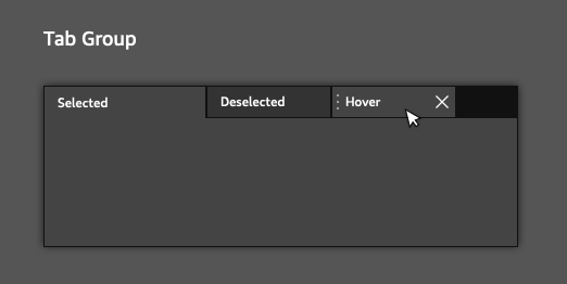
选项卡还可以显示操作工具栏,可在其中根据需要添加和删除操作按钮。

使用指南
在设计带有选项卡的 UI 时,请遵循以下准则:
将选项卡显示为其关联内容上方的单行。
标签标签应简洁地描述其中的内容。
Basic 选项卡
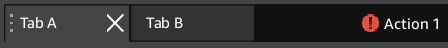
创建一个简单的选项卡小部件,其中包含可移动、可关闭的选项卡和操作工具栏中的操作。
请注意,您还可以使用 AzQtComponents::TabWidgetActionToolBar 类自定义 Tab 键操作工具栏。为此,您需要包含 AzQtComponents/Components/Widgets/TabWidgetActionToolBar.h。您可以使用选项卡小部件的setActionToolBar()函数添加自定义工具栏。
示例
#include <AzQtComponents/Components/Widgets/TabWidget.h>
#include <QAction>

// Create the tab widget.
AzQtComponents::TabWidget* tabWidget = new AzQtComponents::TabWidget(parent);

// Add tabs to the tab widget.
QWidget* tabA = new QWidget();
QWidget* tabB = new QWidget();

tabWidget->addTab(tabA, "Tab A");
tabWidget->addTab(tabB, "Tab B");

// Make the tabs movable.
tabWidget->setMovable(true);

// Make the tabs closeable.
tabWidget->setTabsClosable(true);

// For the tabs to close, TabCloseRequested signal must be connected.
connect(tabWidget, &QTabWidget::tabCloseRequested, tabWidget, &QTabWidget::removeTab);

// Make the action toolbar visible.
tabWidget->setActionToolBarVisible();

// Create an action for the action toolbar and add it to the tab widget.
QAction* action1 = new QAction(QIcon(":/stylesheet/img/table_error.png"), "Action 1", parent);
tabWidget->addAction(action1);

// NOTE: To perform an action when the action button is pressed, you will also need to connect the QAction::triggered signal.
C++ API 参考
有关 tab API 的详细信息,请参阅 O3DE UI 扩展 C++ API 参考 中的以下主题:
相关的 Qt 文档包括以下主题: